It’s been a long time since I’ve posted a status update on this project. Sorry about that. I’ve been meaning to for quite awhile now, but life has been fickle lately. I’d also been working on another, shorter project that just didn’t pan out, so Another Star 2 has been on the back burner for a little while. Still, there’s quite a bit to cover.
The most recent thing I’d been working on is the battle system. This being an RPG, getting it in working order would be a huge leap forward on the project. You may remember one of the very first mock-up images I ever did of the game.
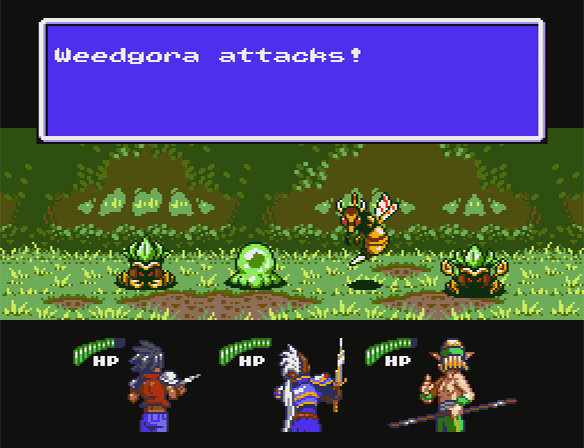
Here’s the battle background from that image, recreated in the engine:

Each battle background (or “arena”, as the game refers to it internally) is only allotted 54 total 8×8 pixel characters to work with, and they have to be arranged into 32 tiles that are 2×2 characters each, although there is some mirroring allowed. These tiles are then fitted into the final layout. In addition, each arena has a unique 10 color palette to work with (the other six colors are reserved for other things, like the window graphics).

But a battle background is just eye candy for the most part. The two most important things in an RPG battle are the enemies, and the party members, so that’s what I dove into next. Because I’m still trying to stay try to tile limitations for the most part, I decided to begin with the largest party member first to make sure they would fit.
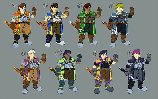
I’ll be using the initial red design for the character, at least for now.
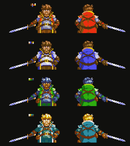
The party member graphics are a bit weird. Instead of being “sprites”, they’re actually made up of background tiles. There are 90 total 8×8 pixel characters in the background character table reserved for the party, and there are three party members at any one given time. Thus each one gets 30 characters, which are all streamed (and each party member is updated on different frames to simulate the fact there wouldn’t be enough CPU power or bandwidth to update all 90 tiles in one frame). They also get an additional four characters each in the form of sprites that can overlay the background, the idea being that weapons would be unique sprites and can be changed out depending on a party member’s equipment. And since the party is located beneath the battle arena and enemies on screen, that means I can do a palette change between scanlines and give each character their own unique half-palette of eight colors.
You’ll notice that this is getting a bit complex. And I’m not sure that’s a good thing…
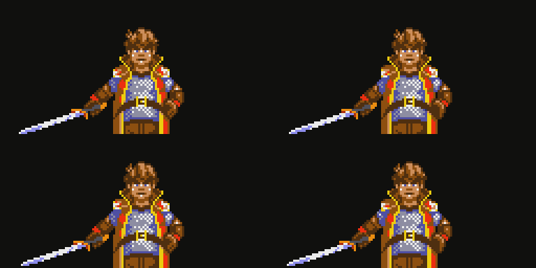
When awaiting orders at the beginning of each round, the party members face the player. This was important to me, so that you can see their faces often. In the original Another Star, each character tended to be really samey. In this game, I really want each personality to shine and stand out on their own, both in the way they look and act in the story, and in the way they play in the game. Having their backs to the player all the time in battle makes them harder to connect with, I think.
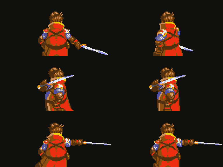
Each party member is updated every six frames. That’s only 10 frames per second, but does emulate the graphics-limited look of the era. On the other hand it’s also a bit sluggish for things like this attack here.
Enemies, on the other hand, work a lot differently, and are actually much simpler. Almost all the sprite character table is free for use by enemies, but the party members would already be hogging all the bandwidth of the console with their streaming which means the enemies need to have all their graphics loaded into memory at all times. Still, bigger enemies can use up more room, and smaller, simpler enemies can use less, so long as all the enemies together in a given battle don’t go over the limit.
I began with the most basic, iconic enemy from the first game: a “weedgora”.
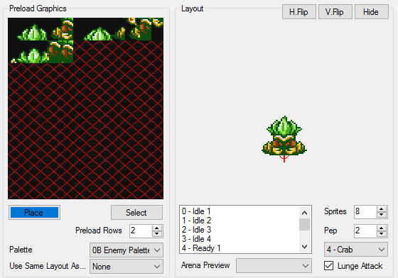
The original Another Star was pretty typical of the 8-bit era. You usually had big, colorful enemy graphics, but they didn’t move or animate to save on cartridge space. Another Star 2, on the other hand, has vibrant enemies that animate and can scurry about. Mr. Weedgora here, for example, shuffles from side to side while he idles.
Like party members, enemies also get a unique half-palette, but there can only be two half-palettes at a time so some enemies in a battle will have to share them (all other colors are used by the background and interface). I’m also toying with the idea of enemies having palette swaps that are only cosmetic. For example, our weedgora friend here might have bright green foliage in the bountiful grasslands, but on the dry steppes of the world his leaves might be a more subdued yellow, even though his stats have not changed. This could also make palette sharing between enemies more fluid and easier to work with.
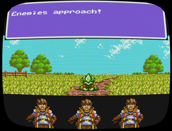
So here we are, with the initial framework of a battle system in place. However, one of the last things I worked on was something I got stuck at, and I even knew I would get stuck at for some time. And that’s how it would look when the player goes to issue their orders for the round. The characters and enemies are already taking up so much of the character tables that there’s really not any room left for any other iconography. Here were two alternate styles I toyed with, using just text.
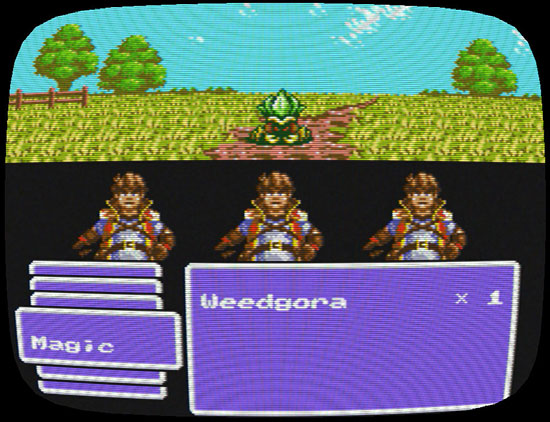
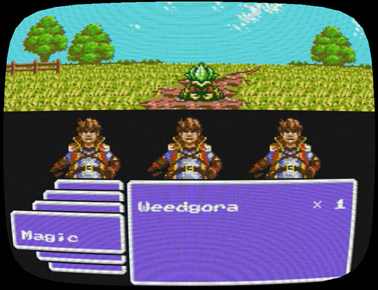
There’s too many options to fit on the screen at one time, so I need some way to let the player know that there’s more they can do, but both of these seem more messy than anything else. As it is, I’m really straining the limits of the original “rules” that I came up with. It’s looking like something might have to give. Either I need to change how party members and enemies work on-screen, or I need to go back and reconsider the limitations I came up with. Trying to do both will likely result in a much weaker game.
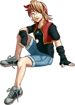

Seems like you may want to ease up a bit on the limitations. One thing that’s a bit unclear to.me is how these limitations are impacting efficiency/production. Are they making it any easier for you to create the game? If not, I’d definitely simplify things as much as you can without eliminating constraints entirely (constraints do contribute to the creative process). The backgrounds and graphics look great, by the way. I like the green outfit, but red looks good, too.
One thing I’m wondering about with AS2 is gameplay. What changes are you considering to the battle system? Any systems you’re planning to add or revamp that are consistent with Another Star’s setting?
I think for AS1, the battle system was good but could have used some work. For example, it needed to provide more strategic choices of actions for the player each round. A lot of battles tended to involve using the same attacks/spells each round because of what was effective for a given enemy or group of enemies. For example, maybe instead of simply having an attack hit all enemies, the player could do that or choose to target a single enemy and do significantly more damage. Another idea might be to have more behavior modes for enemies where the elements/attacks they are vulnerable to changes from round to round or every few rounds. Anyway, just providing some food for thought. Looking forward to AS2 and future updates.
(Sorry I missed this. I’m not getting reply emails from the blog for some reason…)
I plan to talk about the impact of the game’s limitations a little bit in my next entry. In short: the vast majority of the work on the game thus far has gone into designing and programming the tools needed to work with an archaic tile/palette/sprite graphics setup. While I haven’t been able to invest 100% of the past year to production on Another Star 2, that’s still a lot of hours gone into something that players never see directly. At this point, I’ve already decided to go in a slightly different direction.
As for the battle system, there are a number of major changes that I wrote up extensive notes for in the game’s original design document / story outline. However, I don’t want to give any of them away quite yet, until I’ve had some time to play around with them in-game to test how they’ll work. 🙂
I just marathoned AS1 on twitch and came to check your page. I’m pretty excited to see another is in the works.
Best of luck. I guess I’ll explore some of the things I know I missed while I’m waiting…
Thanks! I’m hopeful that everyone enjoys following the game’s development. The original Another Star was developed in a vacuum because I was always so afraid of spoiling anything, but in the end that wasn’t very much fun for anyone.
The battle system looks great. Makes me feel nostalgic. A little bit Shining in the Darkness, a litte bit Phantasy Star 2. Great!
In the past, I’ve never really liked battle systems where the characters are facing away from the player, so I suppose it’s kind of ironic I ended up going with something like this. And liking it so much, for that matter. Phantasy Star 4 and Far East of Eden Zero (the one on the Super Famicom) specifically were probably the biggest references I used when deciding how best to lay out the battle screen when I did the original mockup.