Did you ever have to make up your mind? Pick up on one thing and leave the other behind? Did you ever have to finally decide? Well, that’s how the song goes, anyway.
It can be a difficult thing, though, choosing one path out of many. This indecisiveness can also delay or even kill a project. In my experience, one of the biggest sources of eternal “feature creep” is the failure to draw a line in the sand. “This much and no further.” It’s so hard because doing so means closing out so many more possibilities! So many great things that could have been will now never be!
Here’s a big case in point. This is the palette that I used for Another Star:

Each color is an 8-bit RRRGGGBB value, scaled to NTSC tolerances (so white is less than 100% and black is more than 0%). These sixteen colors went a long way, but they didn’t happen overnight. Even with just sixteen colors to decide upon, and a mere 256 possible values to select from, I went back and forth a lot during the game’s development. I didn’t add the mid-gray color until the game was nearly complete!
However, changing the palette for that game wasn’t a big deal. All the game’s graphics fit into a single image—just 128×128 pixels in the game’s initial release, raised to 512×512 with the new graphics used in the Steam release. Replaced a color? No big deal! I could just edit around it in a few minutes or so.
This game is different, though. The main player character’s sprite sheet alone is about half as big as the first game’s entire graphics set. And that’s just her area map graphics! It doesn’t count her in-battle graphics. And NPCs thus far currently have 128×256 pixel sprite sheets. Notice the plural. “Sheets”. Each one has their own, so changing a single color means I have to edit multiple files, a task that only gets more difficult as time goes on.
A minor change isn’t a big deal, mind you. If I tweak a color in the palette, the colors are stored in a special palette file and that change is applied at runtime by the game’s graphics engine. The sprite sheets themselves don’t contain the colors when they’re saved for use in the game. But if I decide to remove the purple and make a green? Yeah, that’s a big deal. I have to go back to all the characters that used that purple and decide what to replace it with, which may not even be the same for every instance it appears. It means I have to rethink everything up to that point!
Now, this game is a little different from the first. The imaginary VGS console’s graphics are largely based on the Sega Master System, and like the Master System this game actually has access to two palettes, not just one. While the first game stuck with a single sixteen color palette for everything, one of the palettes in this game changes quite regularly based on the room or battle arena and such. However, since there’s only one palette for characters, outside of the special case of their in-battle graphics everyone has to share the same sixteen colors in the second palette (and for sprites, one of those sixteen is always transparent). As much as I hated it, the time came to make up my mind. I had to choose the sixteen color palette (really fifteen, remember) for all the characters in the game to share. I expected it would only take a few days, but I ended up agonizing over it for a good two weeks.
Here is the palette for Another Star 2:

Even now I’m not 100% happy with it, but here it is. This is what I’m using going forward. There will likely be a few tweaks here and there, but only that. Tweaks. No more rehauls. I’ll never be completely happy with it anyway, especially since the limited RRRGGGBB master palette lacks the exact colors I often want to use. But it’s nice and bright and I think the colors really pop, even if they’re a slight bit more saturated than I would like.
It’s strange how I started with the first game’s palette and toyed with it over time. At one point, I actually trashed the palette and went at it anew from scratch, only to end up coming back around to pretty much the exact same colors.
It’s not far from the basic choices of the first game, however I added a hint of blue to the grays to give them a nice cool quality and eventually ended up merging the light gray with the light blue and added an extra mid-tone gray. Most of the colors ended up getting a touch of blue, which does end up somewhat extreme since, with only two bits for blue, there’s only four levels for the blues to be. I toyed with the idea of sacrificing that extra gray or the bright purple for either a richer red (the red I have now is practically a pink) or for a light yellow-green for the greens and yellow to ramp up in to.
There are a lot of browns and grays in the palette, true, but I wanted to be able to represent a wider array of skin tones than we normally see. The midtone gray is likewise used to represent an ebony-skinned character. Earlier versions of the palette lacked a good tone for him and his color ramps clashed pretty badly as you might be able to see in some of the long past videos I posted. I could have just made his skin brown, but I’d rather he get his proper character design in his sprite form.
What’s interesting though is that as I finally nailed down the color palette with one hand I was gleefully opening up a can of worms with the other. On a whim, I decided to add two new “features” to the game engine. One is a minor change, the other is a major change.
The minor change is that characters now have a subpixel resolution to their position. That is, their actual position within a room can be “between” two pixels. This is not something foreign to 8-bit consoles. In Super Mario Bros. on the Famicom and NES Mario has a 1/16 subpixel position in order to tighten his handling and smooth out his acceleration and deceleration. However, it’s a super odd choice for an “8-bit” RPG like this, which is strange enough being a non-action RPG with movement not limited to a grid. Most games of the era didn’t bother, or else they used tricks like alternating each frame which axis got an extra pixel of movement when moving diagonally. I originally was doing the latter, but I ended having to implement different solutions to different areas where it was needed (diagonal movement vs. slower movement on the overworld, for example) and there was an ever-expanding bundle of extra code to deal with edge cases.
Going to subpixel movement made the handling feel pretty slick, especially when you’re using the thumb stick instead of a d-pad. I was unsure at first, but it actually simplified the flow of the code in the end so it’s likely here to stay. Characters have a whopping 120 subpixel resolution, which as the lowest common multiple of 2, 3, 4, 5, 6, and 8 gives a lot of granularity. (Adding 7 to the mix raises the multiple to a whopping 840, which does not fit into a byte.)
The other change seemed more innocent at first, but ended up being far more dramatic…

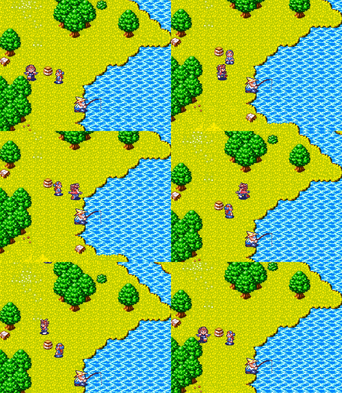
I decided to try giving the characters eight-directional facings just to see how it played. Only a very small handful of 8-bit (or even 16-bit games, for that matter) bothered doing this. The number of NES games that did it can probably be counted on two hands, if that many! Earthbound is the only RPG I’m aware of that used them in that era, and that’s an SNES game. It’s certainly stretching the aesthetic, and I’m not sure that I like the results. Not to mention it’s doubling the sprite graphics workload right out of the gate.
But I’ll be derned if it doesn’t look pretty in action.

This game has been in production off and on for some four years now with little to show for it. I have to stop adding things on a whim and decide what’s important. The scope of this game began big enough as it was, especially as a follow up to such a simple little RPG. I can’t allow it to continue growing and growing forever. As Derek Yu once pointed out, finishing things is a skill in and of itself, and one I’m admittedly not very good at. Eventually I have to draw that line in the sand. “This much and no further.”
Eventually…


This is really amazing. It was exciting to find an active blog for the development of Another Star 2. Good luck and godspeed!