Monthly Archives: July 2017

Another Star 2 Dev Log #19: Taking Inventory

It’s been a week and a half now since my last dev log entry where I noted that I was working towards a little playable build of the game for public release. I wanted to finish it by the end of the month. I haven’t made as much progress as I was hoping for, so it looks like I won’t have anything ready quite so soon. I just need to learn how to make games faster, I suppose.

But at least progress is being made, even if it’s not as quick as I was hoping. In the past week I’ve worked on getting the game’s item system up and running. The scripting commands needed for items to be usable haven’t been added yet, but almost everything else is done. This includes the inventory system, which is what I’m going to talk about today.
Another Star 2 screenshot

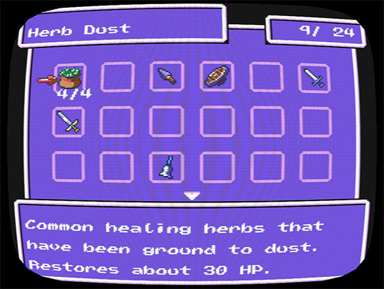
Here’s the main inventory screen.

It’s hard to imagine an RPG without some sort of inventory system. Not that it can’t be done—it certainly can. But it’s such a fundamental simulation of how we store and use our tools and possessions in real life that it’s not just a cornerstone of RPGs, but of countless other genres as well. Items are usually very important in RPGs. You are an adventurer! Here is your sword! Here is your shield! Another Star 2, of course, is no exception.

Inventories in games tend to be broken down into two camps: infinite inventories that can hold everything, and limited inventories that only allow you to carry so many items (often based on weight, or count, or a combination thereof). Personally, I kind of like inventory management, so long as it’s not too tedious, which is the main reason why Another Star had a limited inventory.

For a limited inventory to work well, the player needs to have access to information about the usefulness of items, and they need to be able to understand how much room they have. Both of these allow the player to make informed decisions about what items to keep and what items to toss or sell. Older games tended to fail at the former. Many came with fold-out charts in the box along with the manual. If you didn’t have the chart, there was rarely an in-game way to find how powerful a given weapon or piece of armor is. Thankfully, improved display resolutions and better interface designs have pretty much nipped that problem in the bud.

Informing the player about the space left in their inventory still tends to be a problem, though. Bethesda games like Skyrim and Fallout are an example of this. Those games’ inventories are limited based on weight, but when it’s time to clear out your inventory it’s often a struggle to figure out where all the weight is. Is it a few heavy items, or many light items that are the problem? This is an area where Another Star failed, I think. In Another Star you had 50 item slots. Players usually didn’t realize this, though, because other than an untitled counter up in the corner of the inventory screen the game never really tells you up-front. Most players discover the item limit when they go to open a chest or buy something and the game suddenly tells them that they’re already full.

There are a few ways I want to approach this differently in Another Star 2. First off, you’ll notice that the inventory isn’t an old-style list of text, it’s icon-based. The graphics aren’t just to be pretty. They add some valuable information that text alone has trouble conveying. There are visible slots for items to be in, so it’s easy for the player to realize at a glance “oh, I only have this much room” without being explicitly told. Second, the inventory is going to be smaller at first. Maybe a dozen or so item slots at the beginning of the game. This means that the first time the player opens up the inventory, they’ll see that there are less slots on screen than there is room for, meaning they don’t have to scroll down before they realize the item slots don’t go on forever. It also lets them “practice” managing a small inventory early in the game that’s easy to track while they’re still figuring out how different sorts of items are useful. Don’t worry about the small starting inventory too much. Unlike the first Another Star, as this game goes on you’ll be able to earn more inventory slots.

One more thing I’d like to do is to better encourage the player to use their items instead of hording them just for boss battles. The first Another Star had lots of battle-minded items like nets and bait that were useful in certain situations. However, other than the throwing stars and bows, even I usually just sell them when I go back and play the game. I want items you find to look and sound like they’d be fun to use when you come across them so that you’ll want to try them out right away. I also want to make items like this more reliable. Why shouldn’t the net always immobilize or slow down low-level non-intelligent enemies instead of only working half the time? If it’s reliable instead of a gamble, people will want to make use of them because now they’re a dependable tactic in battle. Plus, if it isn’t as useful on bosses, players are likely to be less stingy with them.
Another Star 2 screenshot

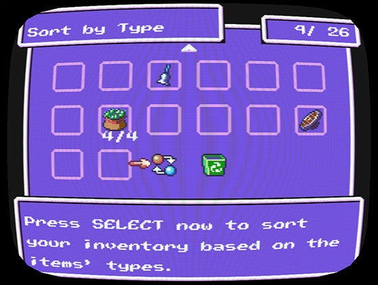
This option sorts your entire inventory by type, name, or how long you’ve had each item.

The one thing I haven’t quite figured out yet is “key” items. These were a problem in Another Star. They took up room in your inventory, but the game would never deny you one when you were out of inventory room. What sometimes happened is that a player would end up with 51 items or more in their inventory because they’d just gotten some key items. They’d go sell a single item when told to free up room to buy something, then get confused when they still couldn’t buy the thing since their inventory was now at 50—still no room.

In my original notes for the game I planned to not have key items count towards the item total at all, but this might also be confusing, suddenly adding extra slots when you go over the limit just to have them disappear when you sell off items to make room. Most games tend to solve this by moving key items to their own special inventory, but I’m not sure this is a good idea for Another Star 2. In the first game, key items weren’t just MacGuffins that have no purpose. They were often items that you could equip, such as the very useful “Father’s Pendant” accessory acquired early in the game. If they’re all in their own little “key item” inventory, the player is less likely to remember them or even realize they can be used. I may make some sort of “overflow” inventory where key items get banished to when you acquire one but have no room for it.

I suppose I should also mention to two icons at the end of the inventory screen. The first is just a simple sort option, as pointed out in the caption above. Another Star 1 also had this. Selecting it multiple times in a row has the game sort your inventory by a few different criteria. I assume most people will use this if their inventory starts to get too cluttered instead of doing it all manually by hand, especially as the inventory size grows.

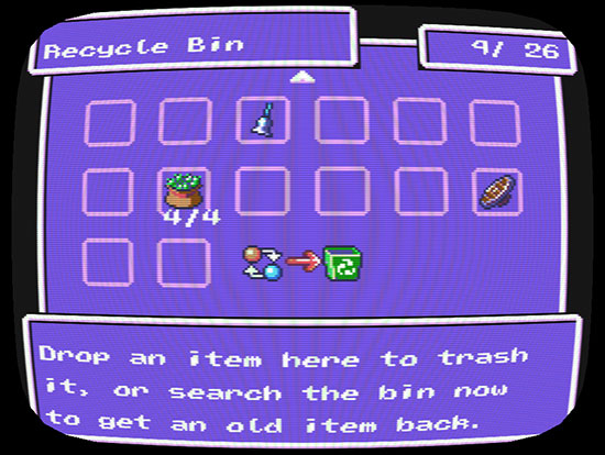
The second icon is more interesting to me, though. In my original mock-up image of the inventory I added a recycling symbol to the trash bin to make it more obvious that when you “drop” an item, you aren’t just throwing it away. As in the first game you get a little loot for it, although it’s just a pittance so that it’s still more worthwhile to hold on to it until you can sell it, if possible.

When I began working on the inventory this week, I went back to that mock-up in order to figure out where to put everything on the screen. When I did, I couldn’t remember at first why I made it a recycle bin icon and not an actual trash icon. It reminded me so much of the “recycle bin” in modern operating systems that I decided to just roll with it.
Another Star 2 screenshot

Thanks for the gamedev pointers, Windows 95!

When you drop an item into the inventory’s recycle bin, you get your bit of loot, but the item isn’t actually disposed of yet. The most recent five items remain in the bin. If you change your mind, or pressed the button by mistake in a hurry, you can open up the recycle bin and select the item to get it back so long as you still have the loot from it, and have room in your inventory.

Now, it is possible in theory to abuse this mechanic to get five extra slots in your inventory. However, it’s not as simple as you might think. Nothing in the recycle bin is safe; not once you leave the status menu and go back to exploring. If you die in battle, the entire contents of the bin is gone forever even if you choose to retry the battle. They’ll also be gone if you ever reload a save. They aren’t even guaranteed to be there while just walking around as maybe they’ll start to randomly disappear from the bin after just a few seconds.
Another Star 2 captured footage

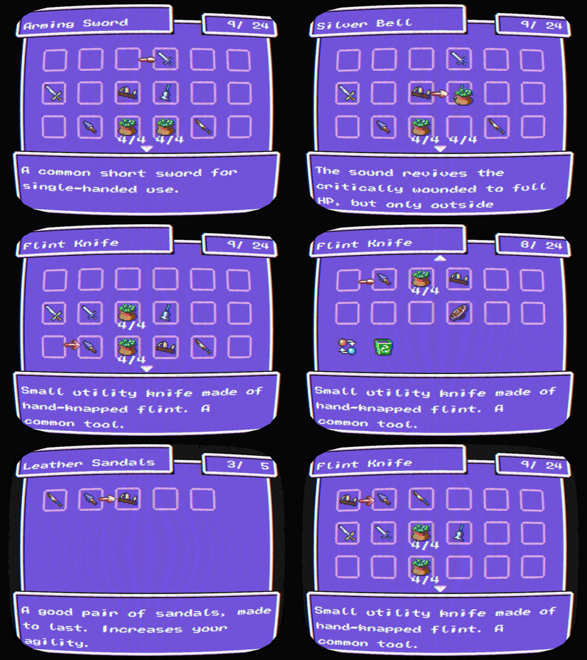
Here’s the inventory in action.

Well, that pretty much sums up the inventory and my thoughts on it. What are your preferences when it comes to the way games handle items? What are some of your examples of both good and bad inventory designs in games you’ve played?

I think my next goal now is to get the character status and equipment screens up and running. Hopefully those go more quickly.
Another Star 2 Dev Log #18: The Path Forward

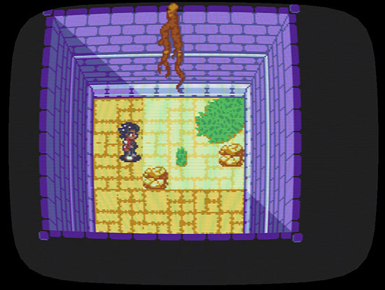
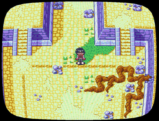
Lately, I’ve been working on a new tileset. This will be used for many of the ruins dotted across the world of Byo, built by all sorts of past civilizations that have come and gone.

Another Star 2 screenshot

My tilesets usually begin as mockups, like this one. I can display images in the engine to test them.

Ruins can be kind of tricky to get right with low resolution tile-based graphics, because if they look too nice and uniform then they just look like slightly run-down castles instead of crumbling ruins being slowly reclaimed by vegetation. I’ve been looking at Star Ocean: Blue Sphere a lot lately for inspiration on this. It’s a Game Boy Color game that never left Japan, and it has some really nice looking ruins (well actually, it has some really nice looking everything). That game’s graphics show what you can accomplish even on a grid with limited colors.

Another Star 2 screenshot

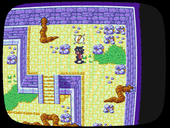
I added roots and broken floors to make it feel more run down. Variety helps keep it from looking too clean.

Some of my biggest progress in the past week has been finally hooking rooms up to the battle system. Encounters now trigger, and you can accept them as in the first game to begin a battle. After the battle, you get experience and loot, and are returned to the room to continue exploring. So far every battle is exactly the same because enemy parties haven’t been properly implemented, and your HP isn’t tracked between battles because the characters aren’t actually in your party, but it’s starting to feel like a real game at last. (I even find myself reflexively pressing the A button as soon as I hear the ambush alert sound, even though ambushes don’t begin on their own yet.)

Another Star 2 screenshot

“BEE-DA-LEE-DA-LEEP!”

I began Another Star 2 about a year and a half ago. While I haven’t been working on the game that whole time, a great chunk of that year and a half has been dedicated towards this one project. It can get a little frustrating when it takes so long for something to bear fruit. The first Another Star was playable within just hours, and could be played from beginning to end within a few months. (Completing it took much longer, though; about nine months all together.)

But with Another Star 2 I’m only now getting the map system and battle system to tie into each other. Granted, I spent a lot of time building a new engine for Another Star 2 in C++, while the majority of the first game’s basic code was put together long before I began work on it. Still, this is taking a lot longer than it should. Even ignoring the time I spent before rebooting the engine, I’ve poured a lot of work into this with very little to show for it.

It’s time to change all that.

Early on in Another Star’s development, I put up a very early version of the game for download, jokingly calling it a “leaked” version. It was unpolished and had lots of bugs and typos, but it was complete up through about the third or fourth dungeon. I wasn’t having very much luck with finding people who wanted to playtest the game for me at that point, so this was sort of my last-ditch effort to get feedback. I was hoping a few people would try it out, but to my surprise it really took off. (Granted, I assumed “now they’re interested and will buy it when it’s released” instead of continuing to post about the game and keep those people engaged, but that’s another topic for another day.)

I’d like to do some similar things with this game. The first phase of that will be a preview build of the game. This won’t be a full “leaked” release containing lots of unfinished dungeons. It will be more like a small demo in that, while incomplete, it will have some level of polish and be self-contained with an achievable end goal. I suppose this is akin to what many professional developers call a “vertical slice”. The idea here is that the demo will be centered around a single small dungeon. It will give players a chance to try out the game, get interested, and give feedback. It also allows me to figure out how to streamline content creation so that I can churn out the assets for the full game. It will also help me decide what constitutes a “small” dungeon, how big a “full” dungeon should be, and how many the final game needs. This preview build won’t be long. Maybe a half hour at most, and I think most of that will be just from getting used to a new game and trying things out.

Since I now have something to work towards, instead of aimlessly deciding what to work on next I can map out definite tasks that need to be completed. RPGs are really difficult to boil down to their essentials, because they need so many different components to work together before they are all that interesting. Thinking it over, I believe the following things need to be done in order to release this preview build. In no particular order:

  • The preview build needs a small, non-linear dungeon to explore. I have a rough layout planned, and am already playing with room layouts to figure out how build they should be. Because the player character can run, and because the characters are larger than the first game, rooms may need to be rather big in order to avoid feeling cramped.
  • The dungeon needs a couple of tilesets to build these rooms out of. (This part is mostly done; the outside tileset for the ruins is the only one I haven’t done any work on yet.)
  • There should be optional areas and secrets to find, encouraging the player to explore, and making the dungeon feel more like a real place instead of a simple obstacle course.
  • There needs to be a variety of enemies. The enemies have to be drawn and animated, and they have to formed into enemy parties (called “formations” in the As2Tool editor). The game also needs to decide on which formation to use from several possibilities per room.
  • There should be a challenging end boss for the dungeon. Of course, they have to be bigger and more impressive than normal enemies, because that’s what makes them a boss!
  • There needs to be a battle background or two for the ruins. Right now, the only backgrounds in the game are tests from early in the game’s development, and they don’t match the direction that the art style has been going. (Also, none of them are ruins.)
  • Battles need to be further fleshed out. Right now, all either side can do is attack. The foundation of the enemy AI also needs to be implemented.
  • There needs to be a full party to play with. That means three playable characters need to have a full set of animations for moving around, and for battle. Thus far, no playable characters have more than a handful of frames. Ridley, the game’s main character, will be one of the party members in the preview build. I haven’t decided yet who the other two will be. Ideally, they should bring a good balance to the team, because the player’s customization options for them are going to be super-limited compared to the finished game.
  • There needs to be a few different pieces of music, though they don’t have to be 100% finished. Most needed are: the dungeon’s theme, a battle theme, and a victory theme. These three all exist in varying states, but I don’t think the dungeon theme or battle theme are ready even for the preview build.
  • Items and equipment need to be implemented. It won’t be much fun to explore if there isn’t anything to find as a reward.
  • The playable character’s battle sprites need attachment points for their weapon sprites. The basic code for attaching sprites to each other has existed in the code for some time now, but there’s currently no way to place these attachment points in As2Tool’s sprite editor.
  • The status menu needs to be up and running. Everything in the status menu needn’t be functional, but the basic ability to check your party’s current health and inventory are a must. The actual status page showing each character’s detailed stats is likely to be a placeholder for now, though.
  • I need to continue working on the scripting engine so that I can not only add interactive objects to a room, but also play out said interactions through dialog and cut scenes.
  • Said cut scenes need to be written. There should be a few as the player progresses, letting the preview build’s little side story play out. This will give players a chance to get a feel for the game’s storytelling style.
  • There needs to be some sort of title screen to greet the player when starting the game.
  • There also needs to be a loading screen at startup. Right now, the game window remains invisible until its initial resources are in place, which takes a few seconds and may confuse players.
  • There needs to be a game over screen, and a way for the player to carry on without having to start all over from the beginning.

Another Star 2 screenshot

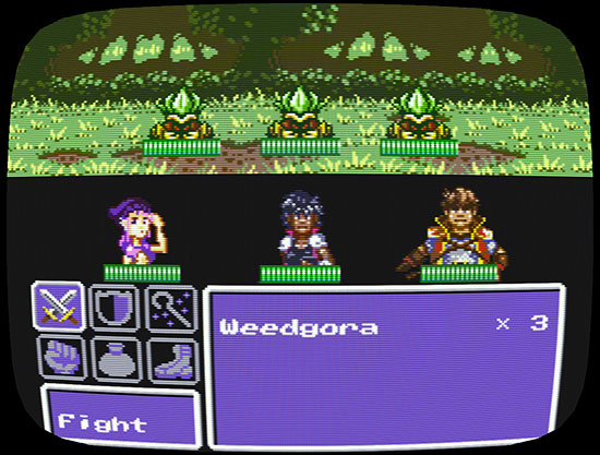
Pictured: every single battle in the game right now. Every. Single. One.

In the interest of getting this preview build out the door, there are other tasks that are needed for the final game that, maybe, just maybe, aren’t that important yet. Some of these include:

  • Magic. It may not be implemented in the preview build. Items and magic both use scripting to function, so they’re quite similar, but magic needs additional visual functions whereas most items can get by with a basic “use item” animation from the character and some text.
  • Likewise, The characters almost certainly will not have their skills implemented, even if I implement magic in time for the preview build.
  • PC games tend to have pretty large and complex option menus. A lot of this has to do with the wide variety of hardware you need to accommodate. I may put off programming this for now.
  • Difficulty levels will absolutely be in the final game. However, you might not be able to select your difficulty level in this preview build because that would require having a working options menu.
  • It would be nice to have a town in the demo so that you can buy supplies. Maybe the preview build even starts in the town and then you leave for the dungeon using an option in the town menu? However, while the town itself would be very easy to script, I’d have to set the game up to handle said script, so I’ll likely put that off. You might get a merchant somewhere at the beginning of the dungeon instead.
  • Another Star 2 has a new system planned for its leveling-up mechanic. It takes more work than just telling the player what stats got raised, though. For this preview build I may just give the character some more HP and call it a day. Your other stats are not quite as important in Another Star 2 as they were in Another Star; for a single dungeon, just improving your characters with stronger equipment found along the way should be enough to feel like you’re making progress.
  • The game’s overworld is already functional as past dev logs have shown, but there’s not really a reason to use it for this preview build. And while the mini-dungeon used here will almost certainly be in the game, I haven’t even decided its position in the world anyway.
  • You may or may not be able to save your game.

The goal here is to have this preview build out sooner rather than later. My aim is to have it up and running by the end of the month, but more likely it’ll be well into August. A lot of this also depends on how much time I have to devote to the project. Depending on how real life plays out, Another Star 2 may have to set on the backburner for a bit. In any case, I’ll continue to post on my progress and give insights into Another Star 2’s mechanics and development as I do my best to press forward.