Lately, I’ve been spending a lot of time working on the graphics for the game’s overworld. Yes, yes, I know I keep saying I’m going to do the scripting next, but I wanted something to test the scripting on. Besides, scripts by themselves don’t make for very interesting pictures that you can post online to get people excited.
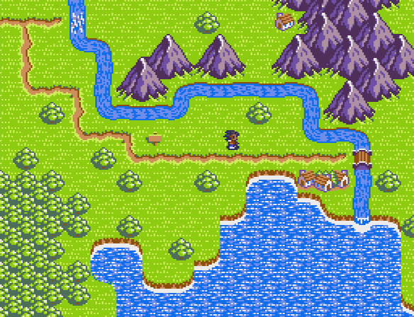
Like with everything else in Another Star 2, it was important to me that just looking at the overworld should make you really want to play the game. I wanted the graphics not only to be bright and inviting, I wanted them to have a consistent feel, with a standardized scale—even if that scale wasn’t remotely realistic. I wanted the overworld to look big, so I went the Chrono Trigger route and made the player character small. And I created huge, detailed mountains pretty early on, and tried to make everything else fit around them. They’re bigger mountains than would really be feasible in the amount of VRAM the pretend console system supposedly has, but they came out too good to throw away!

But there was a lot I wanted to change from the mockup. I wasn’t happy with the trees, and I also wanted multiple types of forests. I thought it would be neat if broadleaf forests dominated the warmer areas near this world’s equator, while conifers begin to dominate as you get closer to the poles. By arranging the conifers in columns, I was able to add an entire forest type to the tileset while only needing three unique tiles. Getting the scale right took some trial and error. I like the original conifer forest tiles shown above, but they just didn’t fit in well with everything else. I also lightened the darkest green of the palette, to make it more obvious you can walk over the forest tiles. I really like the touch of blue it added.
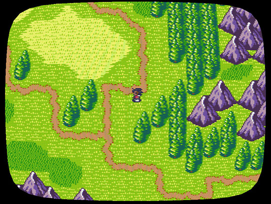
Another thing I didn’t like about the original mockup is the coastline. I made it pretty plain because I couldn’t get a beach that I liked, so I just sort of did a callback to the first game’s rounded coastlines. Coasts like that would have required less tiles, too. But since I already threw virtually all the game’s hard technical limits out, I didn’t really have to care, and so I experimented until I came up with some nice cliffs.
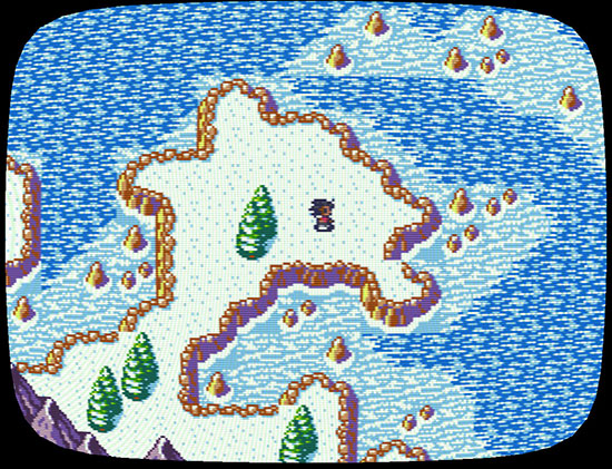
Rivers were another struggle. I didn’t want to just reuse the ocean. I wanted real rivers this time! I don’t have any screenshots of my early attempts, but the early rivers were all a full tile wide so that I wouldn’t need unique tiles for both snow and grass and whatever else there might be for the river to plow through. But it all came out so blocky that it just wasn’t working, especially with how organic everything else was starting to look. I finally gave in and made them more similar to the dirt roads. Suddenly, the ability to snake the rivers all over the place really began to sell it.
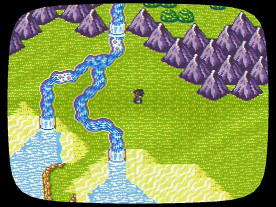
I also created proper beaches for the variety. It took eight frames to make the surf look right, pretty high for an 8-bit title, but I think it’s worth stretching the norm in this case.
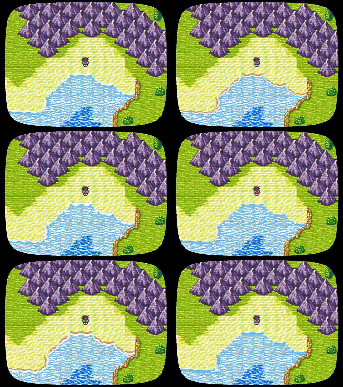
The tileset still needs quite a bit of work. For example, the ocean water looks really nice in stills, but it’s just too busy in motion. Too much pixel noise with everything moving around, detracting from the animation of the coastline. That’ll have to be tweaked. I was also trying to avoid having to do inner diagonals on the beaches. For a game like this, I like the nostalgic feel when certain tiles don’t line up quite right and you can clearly see the grid in spots. But the beach surf just doesn’t look right with all those interruptions in the shoreline.
Yet overall, I am quite pleased with how the overworld is turning out.
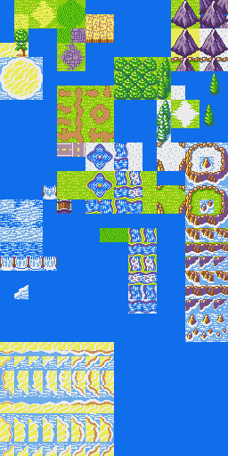
I am also starting to run out of tiles to work with. The way tilesets are stored currently allows for up to a whopping 65,535 individual tiles, but the current room format only allows the first 256 tiles to be properly placed in the grid. The lower 256 tiles shown above are used exclusively for animated frames. 256 tiles is more than enough tiles for what I really should need in a game of this style, but the wide variety I’m trying to achieve on the overworld does demand a lot of graphics. That said, I’m not too worried about it, since almost all the needed terrain types have been implemented. I can always tweak the format later as need be, I suppose.
You’ll notice that there are no cities or villages or caves or anything like that in the tileset. All locations will be purely sprite-based objects, which is where scripting starts to come in to play. I’ll have to start working on that soon, but in the meantime, here’s a video preview of walking about the unfinished overworld. Enjoy!

The water looks amazing in the gif.
The mountains could need a bit more work. Something looks off about them and they make the grid a bit too visible. A bit more variety might help with them (e.g. combining some “4” mountains into one big one). I like in the mockup more that they are more connected to the ground. That completely horizontal line at the top end looks distracting.
Some more variety with the trees when there are many next to each other might also be nice. Like not always putting double trees on a tile but sometimes also only the lower-left one and sometimses only the upper-right one.
That’s my feedback so far. Keep up the good work. 🙂
I may reintroduce the grass growing up at the base of the mountains, but I’m really not wild about the version in the original mockup. It looks more distracting to me than natural. Almost like poorly pixeled spikes or claws surging up out of the ground.
The problem with variety is that it requires more tiles, which in turn would require changes to the engine and map file format to accommodate a larger tilesets. That’s not something I’m opposed to by any means—I want the game to look good so people will play it, after all—but I don’t want to completely abandon the late 8-bit era aesthetic by making things too varied, if that makes any sense. Things will also probably look quite a bit better once actual locations get placed on the map and the map layout gets a bit more polished. I’ll just have to see how development goes and decide from there.