Monthly Archives: April 2016

Another Star 2 Dev Log #5: Return of the Screen Shader

Sometime early in the development of the original Another Star, I happened to think to myself, “I wonder how this would look on an actual tube television set.” So I decided to learn about how GPU shaders work and see how hard it would be to slap a good scanline filter on the game’s output. It was just a spur-of-the-moment thing that I didn’t think would go anywhere, but I was so impressed by the initial results that I ended up seeking out a high-quality CRT filter created for video game emulation and incorporated it into the game.
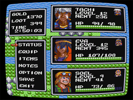
Screenshot of the original Another Star's CRT filter in action.

Another Star in all its glory.

A lot of other games began implementing CRT filters around the time Another Star first came out in 2014, and many more have done so since, so it’s not quite as unique a feature as I’d hoped. But it did give the game the warm, nostalgic feeling of old-style console pixel art. Simulating old displays has come a long way from the time when developers would simply render every other row of pixels and call it a scanline effect. Today’s filters capture the actual look of actual displays by simulating the scanline’s brightness, making up for the dark areas between lines and preventing the picture from looking too dark or washed-out. The higher resolution of modern screens also help out.

Of course, it goes without saying that Another Star 2 will follow its predecessor’s footsteps and do its best to emulate playing the game on an old tube set early Saturday morning in your underwear before your parents get up. And, like Another Star, it’ll be fully optional for those whose system’s can’t handle it, and those who simply don’t want it. (You kids get off my lawn, now!)

It’s always interesting that the first thing people usually compliment me on when they first see Another Star is the screen shader. Which is always a little embarrassing because the screen shader is one of the few things that I didn’t make in the game. It’s a GPL licensed shader written in part by a trio of coders: cgwg, Themaister, and DOLLS. Yes, I rewrote small chunks to fit it into my own engine, and to tweak some of the effects, but it’s not really my work. This time around, I wanted to roll my own.
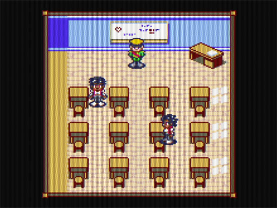
Screenshot of Another Star 2's in-development screen filter.

It’s a work-in-progress, so I hope it will look even better in the future.

So, here it is, the first iteration of Another Star 2’s brand new screen filter. You’ll notice that it does away with the traditional horizontal scanlines more commonly seen on old computer and arcade displays and instead works to emulate the staggered, big-holed shadow masks of consumer television sets. This is more true to the game’s status as a “home console game”. It’s more noticeable when you zoom in for a closer look.
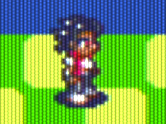
Screenshot of Another Star 2's in-development screen filter.

“Don’t sit so close to the screen!”

Currently, the shader doesn’t emulate the separate red, green, and blue rectangles that you’d see on a real tube-style television set. My early tests trying to accomplish this programmatically didn’t produce satisfactory results, so it’ll probably take a texture reference to pull off. But to be honest, I’m not even sure it’s completely needed. Zoomed out to the normal viewing distance, you wouldn’t see those anyway. I may decide it’s more processing power to no end and just not implement it.

You’ll also notice that it currently lacks the rounding of the television screen, which makes the vertical lines really noticeable and a bit distracting when resized for most of these screenshots. It looks much better in-game, though, and I think the slight rounding should mostly eliminate the artifacts at lower resolutions. Instead of calculating the screen’s shape in the shader like Another Star’s filter, I’ll probably take a page from J. Kyle Pittman and spread the game’s display across a 3d shape. This should result in much more efficient output than doing it in the shader anyway. I’d really like for the shader to be useable on lower-end laptops, something that’s mostly impossible with Another Star’s computation hog of a shader.
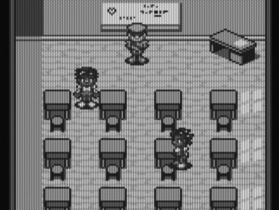
Screenshot of Another Star 2's in-development screen filter.

Sometimes all you had to play your Nintendo on was a cheap old monochrome TV nobody else wanted anymore.

Another Star 2 is also implementing something that I could never quite get to work in the original Another Star, and that’s NTSC artifacts. When it came to color, NTSC was a horrible, horrible display standard that plagued us until the advent of HDTV. Running it through a low-quality connection like an RF cable made it look even worse by causing the colors to carelessly bleed into each other (even more than usual). It should be a real nostalgia trip for those of us old enough to recall it. Remember trying to fiddle with the television’s tint knob so that the colors looked right?
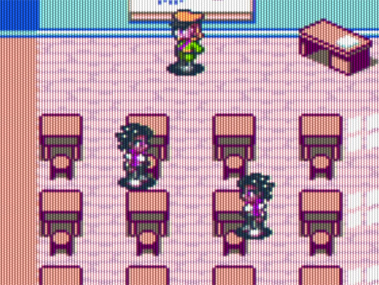
Screenshot of Another Star 2's in-development screen filter.

Not pictured: figuring out whether the TV had to be on channel 3 or channel 4.

Thankfully, you’ll have some input into the output quality of the shader, so if you want to play with the screen shader enabled but want to minimize the NTSC artifacts and blurring, you’ll be able to do it from the game’s options menu.

And, of course, Another Star 2 is not actually an old game, so I don’t plan to rely on the screen effects as a crutch. They’re there to compliment the game’s style, not to stand in for or take the place of real gameplay. I have a lot of ideas on how to continue to innovate on the old RPG mechanics I first toyed with in Another Star. Hopefully you’ll agree when you get the chance to play through the game yourself.

And speaking of gameplay, I’ve got text boxes up and running!
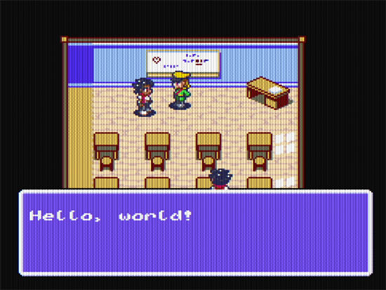
Screenshot of a text box in Another Star 2.

“Hello everybody!”

Although the scripting systems aren’t in place yet, the game can detect when you interact with NPCs and opens this little dialog box for you. The actual scripting isn’t too far off now. I’ll probably discuss text and game localization next time, so stay tuned. (No pun intended.)
Let’s Play Another Star!

A Let’s Player by the name of MrGazillion has just completed a blind Let’s Play of Another Star! Here’s the first episode, and you should really give it a watch:

I’ve never actually seen someone really sit down and play through my games before, other than roping a few family members to try them when I was much younger, so this is a new experience for me. As a developer, it’s pretty amazing to be able to watch as a new player picks up the game and gives insight into how they approach it and what they’re thinking. It’s one thing when people explain their thoughts on a game afterwards, but it’s quite another to see it firsthand and figure out what game systems players are overlooking, not understanding, or just not enjoying. There’s more than a few things MrGazillion missed that are probably far more my fault than his.

Developing Another Star felt like fumbling around in the dark a lot of the time. A few people did try the game and give they’re thoughts, and for that I will be ever grateful, but with so little total feedback it was really hard to figure out what was working and what was not. In many ways, I think the game suffered from my lack of direction. Thankfully, I have a feeling that Another Star 2 will have no shortage of volunteers to test it out.

MrGazillion has Let’s Plays of quite a few indie and niche RPGs on his channel, so you should totally go check it out if that’s your thing.

Another Star 2 Dev Log #4: First Screenshots

In the last dev log, I promised to show screenshots from the actual game engine instead of just mock-ups, and that’s exactly what I have in store for you today. Prepare to be amazed! Behold, the very first screenshot ever from Another Star 2:

Another Star 2 Screenshot

I’d say it’s almost ready to ship.

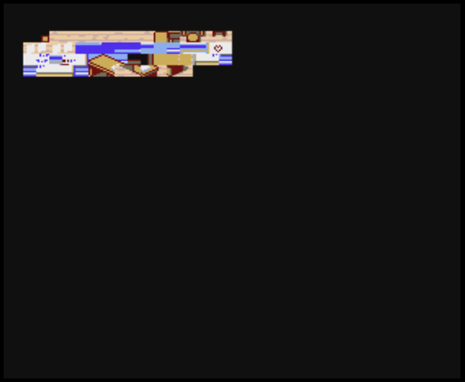
Okay, so that’s not very impressive at all. But with some work, it eventually improved to this:

Another Star 2 Screenshot

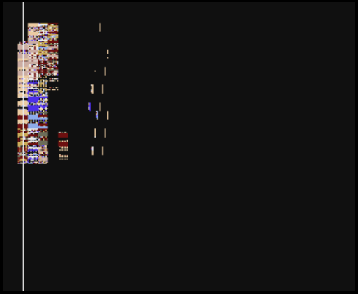
A test render of the 8×8 pixels characters used to build a tile set.

What you see above were the first steps towards getting the game’s graphics up and running by uncompressing the character graphics from the game’s data file and then sticking them in the nametable (tile map) to show up on the screen.

Another Star 2’s display works a lot like an emulator. Most of the work is actually done on the CPU. It renders out the display as a 280×262 pixel texture that contains the 256×224 display, plus the overscan that would be present in an actual signal sent to the television. The CPU is not particularly efficient at drawing things, which is why these days we have blazingly-fast parallel processor GPUs that can draw millions upon millions of polygons a second to enormous displays.

However, the visual effects I want to do in Another Star 2 harken back to older, tile-based display processors of the past. They worked quite differently than modern display processors, and because the game can change a lot of display parameters (including the palette and scrolling values) from row to row of pixels, it didn’t seem like it was worth the trouble to format and send a bunch of row information to the GPU every frame and then write a specialized shader to interpret it all. Moreso because it all needs to work on somewhat more limited OpenGL 2.1 hardware, to meet the game’s planned minimum specs. But since the game’s resolution is minuscule, the CPU can handle it fairly easily and relatively quickly anyway. Even in debug mode, on my system the game rarely reaches too far above using 30% of a dual core CPU, spread across two threads. In release mode, that number usually falls to less than 10%.

But enough technobabble, let’s put those characters together into tiles, and then build a map out of them! Yeah! This is going to be great!

Another Star 2 Screenshot

Well, that didn’t work out as planned.

Like a lot of the game’s graphics, the game’s maps are all compressed. In my first attempts, things didn’t go so well, as you can see. But with a little more work, I managed to actually work out all the kinks.

Another Star 2 Screenshot

Not shown: scrolling.

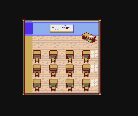
So, now we have working maps. That’s like half the battle right there. Just needed some NPCs to liven things up.

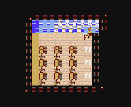
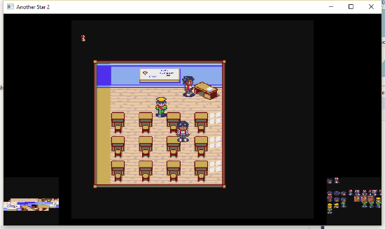
Another Star 2 Screenshot

There wasn’t any collision detection at this point, so they could stand on the tables without worry.

In this screenshot, I’ve included the entire game window to show the little tables on each side of the main screen. They show me what graphics are loaded at any given time, so they’re helpful for debugging. I’ll probably leave a way to pull them up somehow in the final version of the game for those who are interesting in seeing what the game is doing behind the scenes.

At this point in the screenshot collection we’ve caught up to about where I am now, where I have a playable character that can move around the map at will. Unlike the first game, movement is not completely limited to the grid. Pretty unusual for an 8-bit era RPG that wasn’t action-oriented, true, but I think it still stays true enough to the genre, and it makes getting around a little easier because you can move diagonally like a real person.

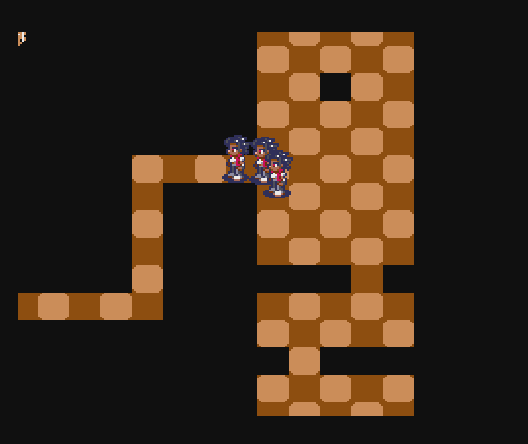
Another Star 2 Screenshot

My clones actively follow me around the map as I walk, like in Chrono Trigger or the Mana games.

It’s starting to look like an actual game!

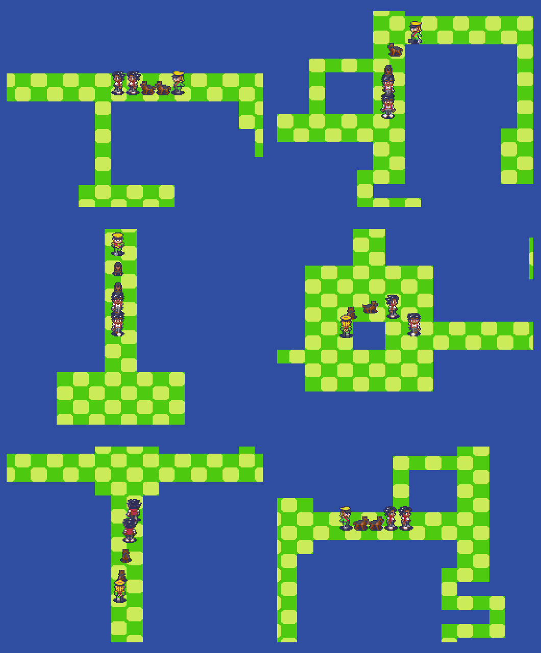
Another Star 2 Screenshot

I added dogs, because why not?

Another Star 2 Dev Log #3: The Tools of Another Star 2 (part 1)

Virtually everything in Another Star but the map layouts and base graphics were hard coded directly into the game. For some things, like item stats, this wasn’t too bad so long as I kept the code organized. For others, like which graphics were used to build individual map tiles, it was an absolute pain whenever something small had to be changed, and usually required me to physically count offsets and coordinates to figure out what belonged where.

Since Another Star 2 is planned to do fun and weird things with palettes and tile layouts, I thought it best to spend some time up front getting a good selection of tools programmed that would help create the game more easily. Most of these tools take the form of a program called ROM Architect.

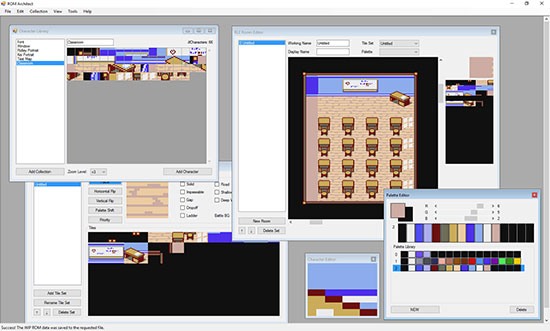
ROM Architect editor screenshot.

ROM Architect is programmed in C# and makes extension use of WinForms. This makes it pretty easy to throw things together and make them work without the rigid hassles of hooking them all up using C/C++ headers.

Let’s take a quick look at ROM Architect’s various components.

ROM Architect editor screenshot.

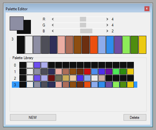
The palette editor is pretty straightforward. It lets you build and preview sixteen color palettes built from the game’s 8-bit BBGGGRRR color scheme. The palette at the bottom is a recreation of the original Another Star’s sole sixteen color palette.

ROM Architect editor screenshot.

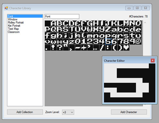
The character library and character editor are used to build and manage the 8×8 pixel graphics that are used to build pretty much everything in Another Star. If I was using modern sprite sheets, this would not be necessary, but I thought it’d be more interesting to try and build everything faithfully to the system limitations of the time.

Of course, it’s pretty hard to build larger graphics while only able to focus on a single 8×8 pixel block at a time, which is why I implemented a copy & paste feature.

ROM Architect editor screenshot.

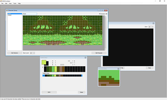
I can build everything in Photoshop, then select what I want to bring over using CTRL+C (well, CTRL+SHIFT+C, since I’m usually copying multiple layers). All I have to do then is recreate the palette in the editor, then paste to the character library. No exporting or importing of files required. ROM Architect will handle breaking everything up into 8×8 pixel chunks and do its best to match color values to fit the current palette. You can see the results above.

The character library even has an automated tool that I can select to then go through everything I just put in it to remove all the duplicates (including those that are flipped/mirrored, if I so choose). From there, I can make further reductions manually as needed.

ROM Architect editor screenshot.

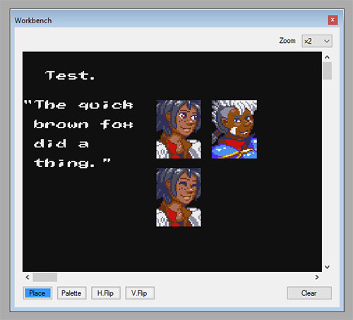
Character layouts can be tested on the Workbench, which exists solely to let me mess around with graphics and see how they fit together without disturbing anything else.

ROM Architect editor screenshot.

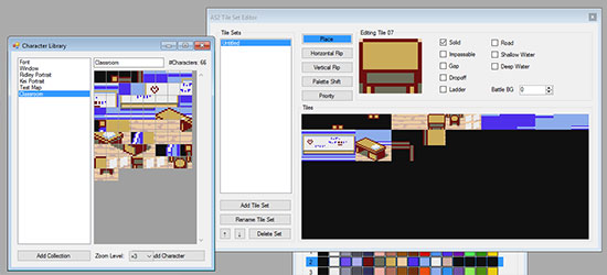
In Another Star 2, all tile sets are 128 tiles in size. This was actually a pretty common tile set size up through the 16-bit era (it let you use the other 128 values of a byte as controllers to do map compression). The Tile Set Editor not only lets me lay the tile’s graphics out by placing characters from the library, but I can also change each tile’s properties.

ROM Architect editor screenshot.

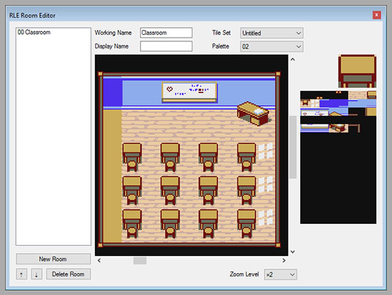
Here’s the RLE Room Editor, which I use to build maps using the tiles created in the Tile Set Editor. RLE stands for run-length encoding, which is how free form RPG maps were typically stored back in the day. An alternative scheme, more popular in platformers, is to create larger “meta-tiles” from the smaller tiles, and then build the level from those to save space.

You’ll notice that the Room Editor lets me select the palette. Palettes are independent of tile sets so that I can get a little more mileage out of them by simply changing the color scheme.

ROM Architect editor screenshot.

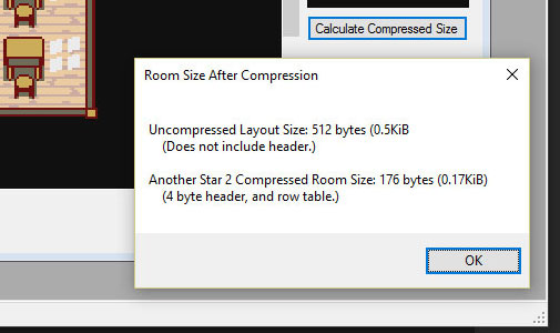
Here’s how much space I can save on this map using Another Star 2’s own RLE compression scheme. Whoo hoo! I saved almost 400 bytes!

You’re probably tired of mock-ups and tools at this point, though, so I’ll end this here. Next week I’ll finally start showing actual stuff from the engine in its early state.

More Mock-Ups

Don’t have a full dev log entry today, but I did do a couple additional mock-ups this week. Menu screens tend to be difficult to figure out, so I figured it best to go ahead and do some test layouts to figure out what all needs to be displayed, and how best to present it.

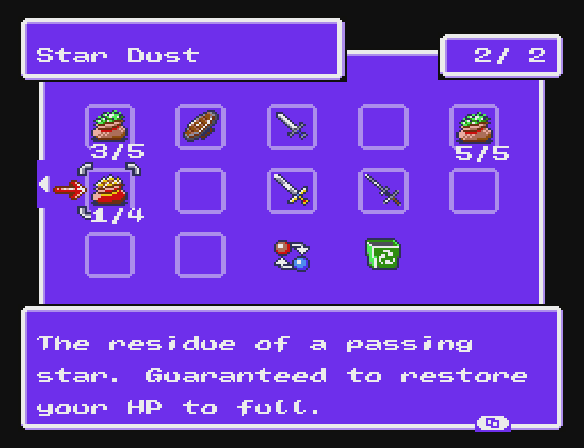
First up is the inventory screen. I wanted to actually show what items look like this time, instead of making do with simply displaying the items’ names.

Inventory mock-up for Another Star 2.

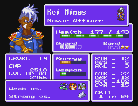
Next is the character status screen. As you can see, I really wanted to make the character themselves stand out instead of just stuffing the screen with text. You might also notice that it toys with the idea of characters having innate elemental weaknesses and strengths just like enemies traditionally do, perhaps forcing the player to take that into account when composing their party for a dungeon. Unfortunately I couldn’t fit the character’s equipment and magic growth on the status screen like in the first game because of this, but I suppose that’s what the equipment screen et al are for.

Character status screen mock-up for Another Star 2.