If you boot up Another Star right now and walk around the map until you accept a battle, here’s what the game will look like:
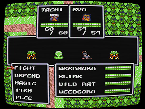
Pretty familiar to any of you who’ve actually played the game, I’m sure. It’s okay, I guess. Adheres to the game’s arbitrary 256 tile limit and all. But it’s pretty plain. But I decided that the game really needed a little more “oomph” for its price point, so here’s what that same battle will look like once you get a chance to play the upcoming version 3 update of Another Star…
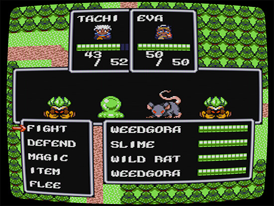
That’s right. Version 3 takes the 256 tile limit and chucks it across the room. The Master System inspiration and 16 color palette remain unchanged, but the game’s battle sprites will be bigger and brighter than ever. Some of the boss fights should be especially exciting with their bigger and more detailed brand new sprite designs.
How much will it cost, you ask? No worries! This will be a free update for everyone who already owns the game. No DLC. No mess. No hassle. You’ve already bought and paid for it. (If you want to thank me for all the work going into this update, tell your friends about the game. Maybe even buy an extra copy to gift to them.)
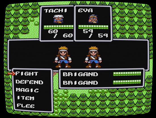
The style is slightly more “cartoony” than I’d originally hoped for, but the new graphics had to work with the engine that was already there. I toyed around with some more realistic(ish) styles, similar to the original Final Fantasy on the NES, but I couldn’t get it to look right with the battle system’s current layout. A complete redesign of the battle system was out of the question, so I went with what I thought looked best.
Furthermore, please note that this update changes only the enemy graphics, no the map graphics. While they could be better, I feel the map graphics are fine just the way they are, and changing them would require a far more dramatic change in the game’s engine and current layout. I feel that sort of effort would be far better spent working on a new game, whereas the battle graphic improvements are a fairly straightforward change that won’t take too long for me to do.
The Version 3 update also brings a few other, less dramatic tweaks to the game.
- The curvature of the CRT effect shaders are now customizable. You can make it look flatter—or even more distorted—than the original release.
- When you enter a new screen, you can turn around and go back to the previous screen right away without having to walk out one tile first.
- Thanks to some cooperation with ioctlLR over at the NVorbis project, the map music should finally be fixed for everyone. When you exit a battle, it should pick up from where it left off, instead of resetting to the beginning every time for some people.
- The gamepad can now be customized in the .ini file, the same way keyboard controls are. This should be a welcome addition for players using some versions of Linux that don’t correctly map gamepad buttons and axes.
- If you want to play the game and admire the original 256 tile limit in all its glory, there’s a setting in the options menu to do just that.
- Various other little bug fixes.
- Maybe a few other surprises, depending on what I have time for?…
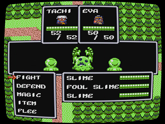
There’s no release date for the version 3 update yet, but it should be ready around either the end of this December, or sometime in January next year. I hope you’re already looking forward to it!

This looks great, Dale!