A couple days ago, I revealed that the enemy graphics in Another Star were getting a makeover for the upcoming version 3 update. While the response was generally positive, a few people—I won’t mention any names, CHRIS—were disappointed that the graphics didn’t really match the style or spirit of the original game. Those entitled, ungrateful people LIKE CHRIS should really learn their place and just be thankful for the free things they get from benevolent people like me.

Unfortunately, those people also happen to be right. Yes, even Chris. In fact, I lamented the fact myself in that very post.
The style is slightly more “cartoony” than I’d originally hoped for, but the new graphics had to work with the engine that was already there. I toyed around with some more realistic(ish) styles, similar to the original Final Fantasy on the NES, but I couldn’t get it to look right with the battle system’s current layout. A complete redesign of the battle system was out of the question, so I went with what I thought looked best.
The current battle system in Another Star limits all enemy graphics (with some minor exceptions) to a 4×4 block of tiles, each tile being 8×8 pixels in size. By moving the enemy graphics down one row of tiles I was able to extend that to a 4×6 block, giving them a little extra height to work with. That’s actually quite a lot of graphical space to work as far as 8-bit consoles go. But the awkward size of the box where enemies are displayed in battle makes it look really cramped when you start to fill it in with larger enemies.

For comparison, let’s look at a screenshot from Final Fantasy.

Most of the enemies in the original Final Fantasy are only 4×4 tiles in size. Yet even though the enemies are all smushed in together, the proportions of the large square box they’re in makes the layout feel pretty roomy instead being completely cramped.
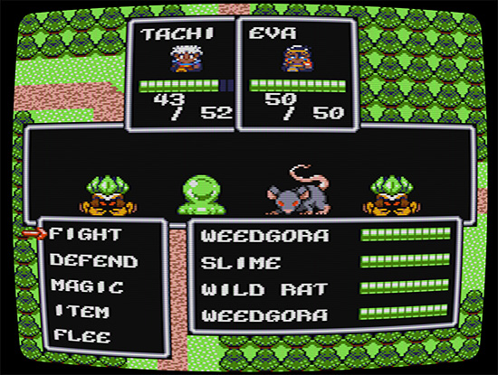
As I said in the previous post, I couldn’t do an overhaul of the original battle system without committing to a lot of effort and trouble that I just don’t have time for. The style I went with seemed to do the best at making the graphics feel right in the space there was. But given the feedback, I felt I could do better. I went back to the drawing board. Now that first battle looks more like this:

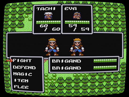
Well, actually that’s probably not the best screenshot to show off what’s changed. The enemies here pretty much just look smaller than the original revisions. Let’s look at the human enemies for a more dramatic difference.

Looks a lot closer to the original style of the enemies, don’t you think? I’m still not 100% happy with how everything looks, so there are likely to be tweaks yet to come, but I think this is the direction version 3 will be going from now on.
I guess the moral of the story here is this: don’t be afraid to give honest, constructive feedback to developers. Being a “yes-man” all the time doesn’t help anyone improve.


