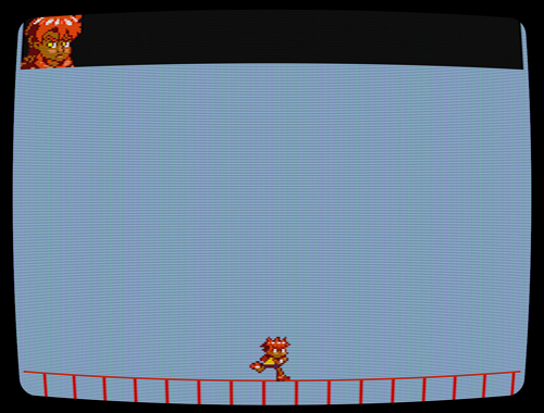
Among people who enjoy Another Star‘s look, one of the first things that gets their attention is the CRT effect that simulates the way old tube television sets look. It’s easily the most praised graphical feature of the game. It’s also one of the few things in the game that I didn’t program myself.
Even though I’ve tried my best to credit the original creators of the shader (cgwg, Themaister, and DOLLS), and adhere to the GPL license their work was released under, it’s still something I feel bad about because people are always complimenting me on it even though I had very little to do with it at all.

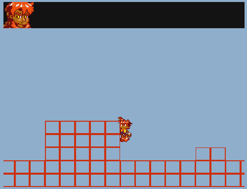
As I begin prototyping my next project, I’m seriously considering doing another game that uses the look of old tube sets. However, while you can see I’m currently still reusing the same filter from Another Star, if I decide to stick with it this time I’m going to go through the trouble of making my own from scratch. It’ll let me get a little closer to the look I really want, and I won’t feel so bad about hogging all the glory.


It’s certainly a feature that gets a lot of attention. Too much even. The problem is that the only visible “uncommon” thing people see in Another Star is the CRT filter. People might like it or hate it, but they won’t even discuss about other things in the game at all.
It isn’t the CRT filter’s fault alone though, it’s also because Another Star simply does not have many uncommon features. Everybody will just see it as generic JRPG clone. Sure you have features like “you don’t select a target”, but this is nothing that’s standing out to the player much, unlike the CRT filter which is visible on every screenshot.
Anyway, I guess you could keep the CRT filter in your future projects and make it some kind of… personal mark. As in “Hey it’s another game of that dude who always uses a CRT filter for his games”. But what you need to do additionally is to add other unique features to your game that actually do stand out (mostly a matter of how you present it), so you games don’t get reduced to the CRT filter.
Oh and not everybody likes it (I do!). When I mentioned your game on Talking Time, it simply ended up in a long discussion about old TVs. Not sure if you have read-access but here a direct link:
http://www.talking-time.net/showthread.php?p=1763800#post1763800
Yeah, that’s one thing I’ve noted before. Another Star doesn’t try to do something new as much as do something old, but do it very well. Combined with the arbitrary tile limit that kept me from going all-out with the graphics, it makes it a bit of a hard sell.
If I’d finished it in October as I’d originally planned, I’d probably have been better off. Things like the 256 tile limit are a lot more interesting on a smaller/quicker project. Oh well. Too late now.
J. Kyle Pittman does this for his games. Here’s a sample. I don’t just want to do “pixel art” games, though, so I’m not sure it’d be as big a benefit for me.
Ha, ha. Yeah, I chanced across that thread a few days ago. (I do a web search every now and then to see what people are saying about the game. I’ve come across a lot of articles about the game that way; some of which I have to run through Google Translate just to read.)
That thread’s not a particularly pleasant read as a designer, but even harsh criticism like that is useful when the writer details why they don’t like something, or feels it doesn’t work.
Also, it really shows my age because I wasn’t sure the “screen” was curved enough! I am sorry for being so old!
(…But I’m not even thirty yet…) D:
Oh I’m older than you then, I just turned thirty, two months ago!
Yeah, I like talking time because they like to discuss about game design rather than just saying “I like it” or “I don’t like it”. I’ve seen some people posting some incredible reasoning why certain Kickstarter campaigns failed too.
That’s also why I said earlier that even negative feedback can be useful and that’s why you should always try to post about your game in different communities.