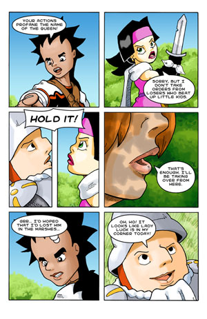
You know, if I had known what I know now, there are several things I would have done differently on Swordmaster Odyssey. They say hindsight is 20/20, though, so I guess I shouldn’t beat myself up too bad about it. I figured I ought to write them down, though, so that I could remember them for next time. 🙂
#1 – Page Size
Instead of using the standard 6 5/8″ x 10 1/4″ American comic book paper size as a guide, I would have used a format more web-friendly. Since Vision Rider’s focus is internet distribution, I should have made each “page” wider than it is tall, to better fit a computer moniter. For the published version, we can make the book whatever size and ratio we want, so we could have stacked them, or just made the book wider to fit them.
#2 – Color
Doing the comic in black and white cuts out as much as 3 hours of work per page. That was the foremost thing on my mind when I made the call to go in that direction. Unfortunantly, while black and white looks just fine in print, it tends to be pretty boring on the screen, more so when you have a fairly colorful web site around it. 😉 Although it would mean less pages per week, looking back I think the trade-off would have been well worth it.
#3 – More Artwork
When it comes down to it, outside of the comic itself, there’s not a whole lot of artwork for Swordmaster Odyssey. That’s a real problem when trying to make ads, icons, and a pretty website. Thankfully, this one is an easier problem to fix, and I’ve been trying to devote some time to doing some nice promotional art.


