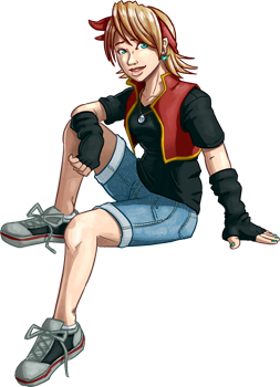
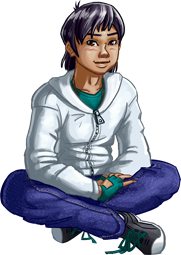
Doing Swordmaster Odyssey purely in solid tones of grays means that finishing up a page is a realitively simple task. There’s generally not a whole lot of work that goes into plopping the gray in there.
However, the system has its drawbacks. It doesn’t look quite as polished as it would had I done an ink wash style, giving it a painted effect sans the color. But the most annoying thing of all is the exact tone of gray. Getting just the right shade of gray is simple enough–But when you look at it on another moniter, it’s a completely different shade! Not only are shades lighter or darker, they’re even closer together or farther apart from each other than I may have initially intended! And it looks different yet again when printed, which may turn out to be a small challenge when Book 1 is finally completed and ready for press later this year.
This issue is something I was aware of before I began and, really, it’s not generally that big a deal (color and tone is much greater issue in television, for the record). However, the art style I chose to do the comic in had an unintended side-effect. You see, getting to tone just right for the lips is one of the hardest parts of cleaning and finishing the line work. If the comic were in color, or even just painted grays instead of solids, the differences between formats and screens would be less noticable.
Heh. Always the little things. 🙂


